96Delta, it is a truly beautiful patch design!
You do not have to change the outline of Japan -- the patch-company artist will render that in the resolution they have available (such as for the island of Malta in the Fire Over Malta patch above).
Likewise, there are some fine details to the outline of the carrier that might not come through, but you should leave it and let the patch company render it in however much detail they can (like the carrier in the Coral Sea patch above).
Here are some changes, though, that I suggest with reasons for the request:
Instead of "ACES HIGH II", having "ACES HIGH" with a superscript "TM" as in "ACES HIGHTM SCENARIO" but with "TM" as superscript (see final Stalin's Fourth patch below).
Instead of "July-August 2006", just "July 2006", as they might need a slightly larger font, and with just "July", it gives them a little room.
A slightly bigger US roudel on the wing of the Corsair, as the one given will be a bit small to render in thread well. (See roundels in the Stalin's Fourth patch below to see how they come out when they are small.)
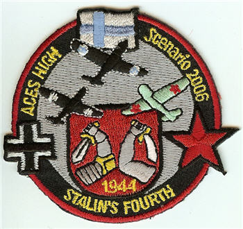
I'd eliminate the pitot tubes on the planes and the four vertical radio masts on the carrier, as they'll be too thin to render well.
The white outlines around the planes and carrier may or may not come out looking how you'd like them. If you have them in, the white thread around will have a stitched look like the middle flag in the Coral Sea patch and like around the black planes in the first Stalin's patch below. If that's OK, keep it. If not, then you'll need to get rid of the white outlines -- it's up to you based on what you think of the white thread stitching outline.

(By the way, for Stalin's Fourth folks, the above is not the patch final. Here is the patch final: )