repost from general discussion just hoping this reaches the right people.
I would like to convey my point of view as best I can on the new terrain so...
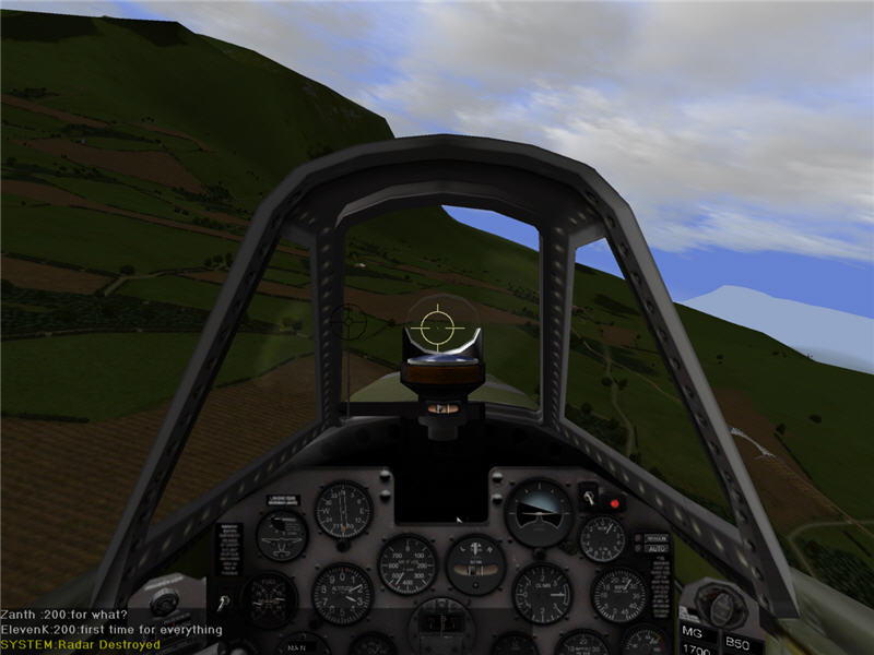
heres me trying not to flip out and conveying my consternation at drastic terrain changes in the latest version that have left the majority of player made skins in the game looking way to light and washed out.
This is not a matter of monitor brightness or contrast. It is a matter if interaction between existing plane artwork and the new terrain which is visible regardless of individual monitor discrepancies. therefore can be controlled only at the source: the aircraft and terrain tile textures themselves.
looking on the bright side at least I made a few p40e's to the origional AH2 dark tile brightness and contrast and they look ok. however if this terrain persists as the new standard I will have to redo every skin I have submitted because the contrast and sifference between the skins and the terrain is to much for me to tolerate if this is indeed the prefered threshold for the arena's contrast color saturation and brightness.
waffle said it himself its all relative. the skins need to be calibrated to a standard background which thus far has been the old arena tile textures themselves.
this new terrain is well detailed and well made but it is of a different style that is nostalgic of warbirds 2.0. the chaos of realism is removed and there is now order and conformity in the textures. (I love the 3d modeling my only beef is with the textures and brightness and color saturation and contrast)
I just don't know what to strive for now. I have been going so hard striving for realism with a bit of saving private ryan band of brothers coloring flare to the skins I have made recently but now I am just lost
I don't even know what looks good any more. now everything looks too washed out or to saturated.
the green is so green that it overpoweres everything and the dark is so dark well i dunno
please help I need sleep.
the terrain could be altered to match the brightness color and contrast threshold of the previous versions textures. if this could be done I would be thrilled with the new terrain
new version... the once shadowy and dark cockpits look pretty bright thought they are unchanged.

old version... with the bright terrain of AH2 that had been revised several times form the origional darknes that plagued it.

old version... the sun is shining bright on the wing of this p51 and on the ground below

new version... the ground is dark the wing of this p51 still glows creating an unrealistic discrepancy

new version.... its just sitting there cut and pasted the plane is not part of the environment it dosnt fit

old version... its there flying in the air you can see its part of the scene the sun is shining on the plane and on the land and sky behind it. all together it pull sitself off as one complete picture

all I want is the old texture threshold for color and brightness and contrast back.
it could remain the two toned green for a long time as long as its a two toned green that is of the same brightness and color saturation as the previous terrain tile textures which had been tweaked so well.
does anyone remember ah2 beta? do we really have to go through all this suffering again when the reference settings for acceptable color saturation and brightness and contrast have already been established by the textures from the previous version?
changing whats in the textures and changing the 3d models is welcomed always but the already established standards for COLOR SATURATION, BRIGHTNESS and CONTRAST have already been established and must be followed for the sanity players making skins and to establish consistency in the interaction between the skins and the terrain itself.