Yaaaay! You fixed the "5."

I'm a bit disappointed in AmarilloUSAF over that. It's a great font, but the 5 and 7 that were used aren't done in the most common style for those two numbers.
Looking good, but the shading of the panel lines could probably stand some lightening up. That's the one thing I see in a lot of skins and plastic models is emphasis on the panel line detailing. But the thing is, you look at photos of real aircraft and this detail is very subdued.
A good comparison is these two images:
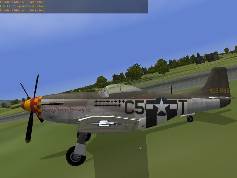

You may also want to stretch the "C" and "5" vertically somewhat. Note the "5" is taller on the bottom section than the top (ok, yeah, nitpicky, but I'm just a stickler for little details).


