1. calm down.
Uhhh... Ok?

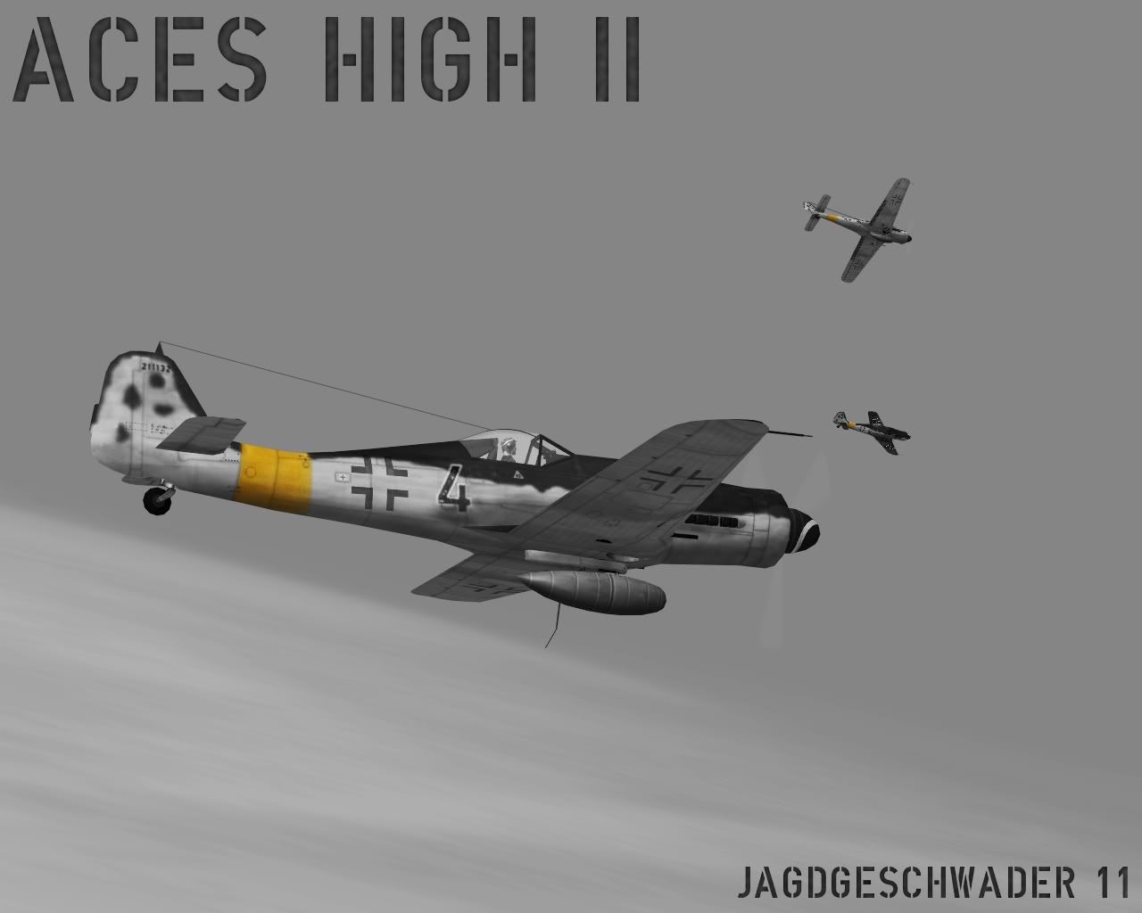
When most people do this effect they use two layers... Black and white.... and normal... then erase the parts of the black and white that they want color to come through at... Having more colors come through sometimes helps the feel of the over all image...
like this, i originally only did red but then found that more colors was a nicer look.
(Image removed from quote.)
just my 2 cents...
Haven't seen it red, I think it would look fine though. You're dealing with something else, though, as the primary colors contrast a bit better (the roundel, bomb stripes etc. ). In a late war Luftwaffe aircraft, beside unit markings, you have something that is all earthy colors that do not contrast well against each other in the same way red, yellow and blue do. Even in your picture the green from the bombs and rockets doesn't look that good IMO. To each his own I guess.
I also realize now that I didn't touch the brightness/contrast or layers

Here we go... deeper blacks and whiter whites, nothing 'eye popping' though. Guess I'm a bit conservative in that respect

