I'd say the rivets and panel lines could use some more opacity.
It's a very clean bird - is that unusual for a '47? Sorta looks right out of the factory door to me. Trailing wing edge perhaps a bit heavily shadowed? Hard to find anything wrong with this one though.
That's why I ask! You're both quite right. I do get rather caught up in the bitmap editing sometimes rathe than the how-it-shows-up-in-game editing.
I need some help in this case. I need suggestions on how to make the metal look better. I did the little mini-tutorial somebody did way back that was most helpful with a spitfire wing as an example. I've got a number of layers with varying shades and gradients just to get the underlying colors. On top of that I've got a few filtered/fabricated layers that give the metal a bit more of a grain to it, and some other layers on top of that that give individual panels some different shades.
That last bit is why the trailing edge looks so dark. Normally the panels right in front if it aren't too different, but those particular panel I gave an offset shade. I'll turn that layer off if I can get the rest looking better.
Here's what the flattened bitmap looks like:

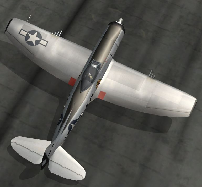
As you can see, in-game it's a bit different:
So, I'll try ramping up the "grain" effect, dialing down or removing the offset shades for panels effect, raising the panel lines. Outside of giving every panel it's own bulging highlight/shadow effect (which I'm not overall a fan of on all skins), what other details make BMF "look good"? What would make this stand out? With paint I can bleach it, black it, smooth it (shine), scratch it, scrape it, fade it, wear it, tear it....
But with metal I really can't do all that. Thoughts?
As a parting comment: I've kind of been of the mindset that the traditional "paint chip" effect doesn't work on BMF and that scratches would simply be lost in the grain and overall sheen of the metal. Perhaps that's why it looks too "clean"? Maybe I need to scratch it up?


