Boy she's one beat up ship. I don't think its an 'R', IIRC Preddy's aircraft were always a 'P'?
I know what you mean about noise. There does seem to be some fading on the panel section just forward of the wind screen? The blue seems lighter there.
Seeing the photo, I think the portions of your 'O' and 'P' covered by the white stripe are too regular and well-defined - that is, it appears we can se too much of the perfect shape of the letters covered by the white stripe. Not sure what to advise - maybe try a little blurring of the portion of the letters under the stripe? Lightly erase variable portions of the letters so it doesn't show through the white stripe so cleanly? subtle streaks/smudges so the edges aren't so regular? Just brainstorming here.
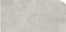
Here's a sample of the dirty white texture I used for my P-39Q and for the white on Down for Double - use it if you want; the grunge seems to help:

You may want to lighten that 'P' on tail as well - I usually end up with markings layer items being 85-90% opacity rather than 100%. It helps tone the image down a little, and allows any panel lines that cut through the image to show up a little better.
Fantastic stuff, lyric. That blue really fades.