How to make squad nose-art
A Theory.
You are going to need 2 pieces of Software to complete this exercise. A raster graphic manipulation program (I use Photoshop) and an outside rastering indexer (I use Bright.) Some people will say this method has too many steps. Well, do it their way then

The only things common between all nose-art submitted to HTC for approval are the size (64 x 64 pixels) and the transparent color (176-176-176.) Other people have had success using other colors as their background transparency layer. However, HTC says 176 is the transparency, so that is what we will be using in this example.
I will be starting the graphic at 256x256 pixels and then reduce it to the final output size of 64x64 at the end. So, lets begin
In Photoshop, start a new graphic (size 256x256) on a white background. Go into your color picker and change the RGB values of the background color to 176-176-176 (yellow box in graphic.)
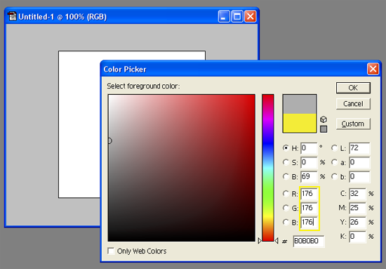
You have now set your transparency layer. Everything else will be built on top of this layer.
Add a new layer. Start building your squad nose-art. I am going to make the nose-art for the AmazinHunks in this example. Use all the real estate you can in the graphic. Go to the very edges of the boundaries.
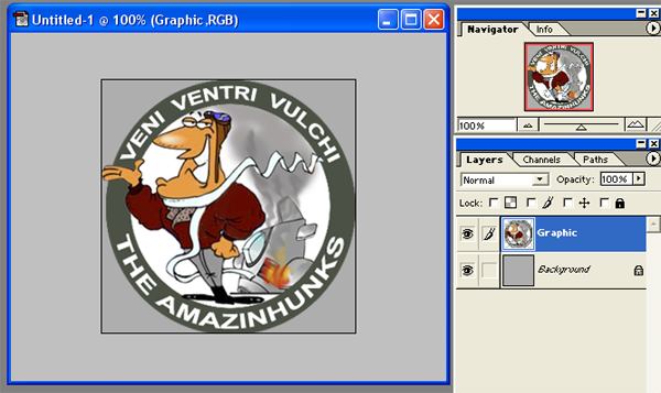
You can make your logo as complex or as simple as you like. But remember these few guidelines as a developer.
1. Use no more than 3 colors in your logo. Absolutely no more than 4 colors. Such a small output size (64x64) will not blend multiple colors well due to the pixelization.
2. A wider (or bold) font will reduce size better than a skinny font. Example would be that Arial Black looks far better at 64x64 than Arial plain (most of the time
YMMV.)
3. A 64x64 graphic will never look as good or crisp as a 256x256 graphic. Dont even fool yourself otherwise. Understand when youre done or you will go insane.
OK, you should now have a brand new, 256x256 graphic that will become your squads nose-art and it is on a 176-176-176 background.. Now lets get that puppy reduced. This is where you start finessing the graphic. Reduce the graphic size by ½. In Photoshop, click on Image/Image Size and type in 128x128, click OK.
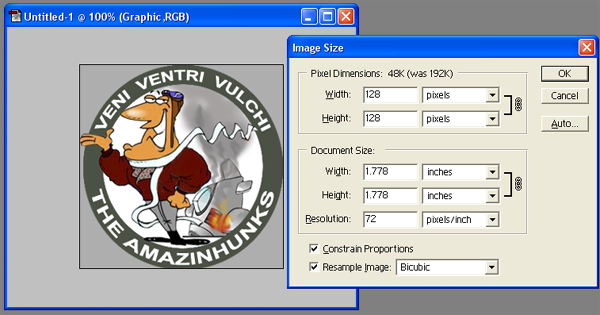

You will now see the graphic at ½ the size you started out at. If you are happy with the way it looks, then repeat the process but resize it to 64x64 (again, we reduce by ½ to maintain crispness.) If you are happy at this point, then you have a correctly sized graphic on HTCs allotted transparency. All we would need to do is index it. However, I have never had one reduce that simple
so lets troubleshoot the most common problems I run into.
1. Graphic is not crisp OR my Dog looks like a Bear

Sometimes when you reduce, you start losing crisp features. You can combat this (sometimes) by blurring your graphic in the step right before you reduce the size. In Photoshop, prior to reducing the size, click on Filter/Blur/Blur (adjust the blur in this menu to where you just start to fuzz the graphic a bit.)

Now reduce the graphic and see if it looks better.
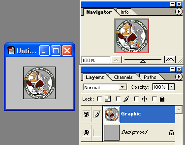
If it does, then Eureka! If not, play with the settings in blur some more. Remember what I said about keeping your graphics simple. Now you see why.
2. I cant read my lettering on my nose-art OR whered my words go!?!
Remember when we talked about wider fonts reducing better than plain Jane ones? Exotic fonts, skinny fonts, ect. All reduce less effectively than a wider font will. That only makes sense really if you think about it. If your font blows out, try resizing the font to a larger size before reducing the overall graphic size. If this doesnt work, try a wider font. I know you want your lettering completely legible for all to see in the game. However, Why? Look at the majority of the squad logos in the Squads folder in HTC's directory and few of the logos are really legible. Most sit right on the fringe of legible and your mind finishes the picture because you know who that squad is. So, get as close as you can but be prepared to accept less if needed. Its a process.
Alright! Graphic is completed and we have what we want to make the noseart. Lets put this puppy in a format that HTC's engine will recognize. An 8bit, Indexed bitmap!
Most people just index right out of their rastering program. Not me though. Im different! Honestly, most of the nose-art I help fix is because the native program the person originally used slightly changes the color output during indexing. If I use my own, external indexer, I never run into that problem. Do as you like, but this is my tutorial after all

Remember to save your original work in whatever format it is you are working in. In Photoshop, this will be a .PSD file. Once saved, you will now do a File/Save As and select Bitmap from the drop down list. Save using the default selections it gives you. Also, save it to a location you can find easily.
Now, Open up your second program, Bright. You can find a download for this program at
www.simmerspaintshop.net (or .com or .org..whatever it is.) Once you have this folder open (it is really just an overworked batch file, not really a software program.) drop your new bitmap inside this folder. Once inside the folder, double-click the MS Dos Batch File (circled in yellow.)
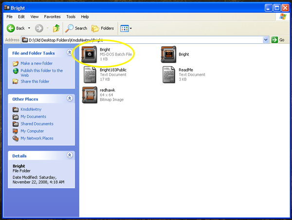
This will automatically start the 8 bit conversion for your bitmap. Once the Batch has stopped working (a few seconds) you now have a properly formatted, 8bit indexed graphic to be used in the game. Rename the bitmap to the Commanders call-sign (redhawk.bmp) and that it!
Hope this helps you gents and ladies out. Here end'eth the lesson

ReDhAwK