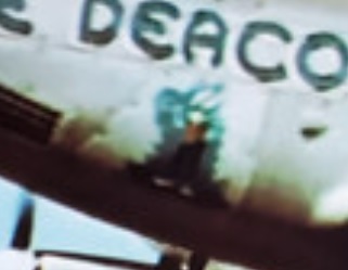
I don't think the figure should have that green glow at the top.
You're going by this picture, but the color exposure is all out of whack.

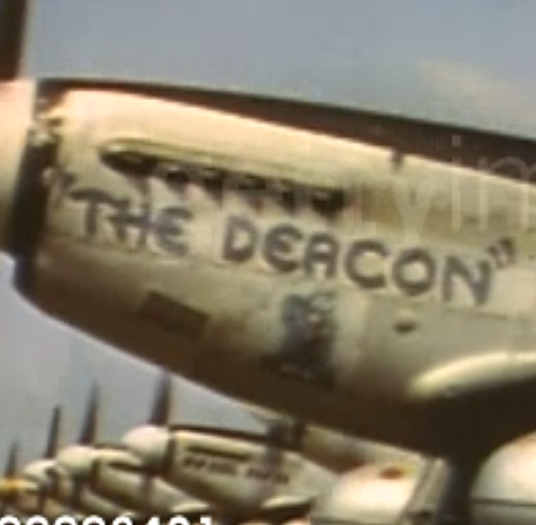
The figure is much more crisp in these pictures. I'd go for this look.


Also, check the sizing of the "The Deacon" script. I think it should be a little larger and bolder (Both in color and character thickness). Your script does not come far enough rearward. The 'A' is just a bit forward of where it should be, but the 'N' is much too forward. This tells me there is a scaling issue at play. Thickening the letters another pixel or 2 while keeping the same spacing might give you a more accurate placement.
Also, perhaps the script is also Insignia Blue and not black. That could explain why it tends to look lighter than the black near it.
Not a cloud its a thought bubble that they use in comic strips. It doubles as a canvas in this case so its a light white wash to make the nose art pop.
I don't see this at all. I see just the plain panel in a light bare aluminium.