Here is the post I was trying to find.
https://bbs.hitechcreations.com/smf/index.php/topic,390589.msg5188631.html#msg5188631
I feel for Dale, but Match Play with prizes was never going to work. I've never seen any game that wasn't already absolutely blasting on pop get that concept to work realistically, and that includes WT (whose devs are constantly mocked for calling the game 'e-sports ready.')
I bet I can walk thru the mind of the average new player in that scenario but those numbers kind of speak for themselves. If 65% of people leave before even finding their way to the arena then the only thing they've gotten to interact with is the User Interface. Clearly the rest of the game behind it never even was opened before them. Ten minutes of being in the main arena tells another story, they're not being informed enough and clearly.
I'm sorry, I really am, but the pop out youtube videos are a dev-time trap, no one in my group has watched any of them and I seriously doubt we're outliers. Even I haven't watched them, but admittedly they weren't for a returning player. They hear the bass boom and shut it off immediately, they want nothing to do with it. They're literally the gaming equivalent of a pop up video ad on a website and cause knee jerk closing reactions. An oldschool 'online' help file would do better, or even a well sorted pdf. Though, I am likely saying that due to my time in the DCS community where most of us will quite happily sit down with flight manuals from devs or a third party and spend hours pouring over them to glean any information we can.
That 75% that have left before the 30 minute mark clearly never even got to try the actual game, it's pretty clear to me from my limited dataset that the UI is murderous because it's stopping player engagement BUT.
BUT. I am willing to admit that maybe it isn't, if its not, what other things in the first 30 minutes of software interaction could they have engaged with that would cause such massive offloading? There's the argument for the game being 'ugly,' which as much as I hate to say it sort of is. I recently opened a copy of 1998 Warbirds and I hate to say it but the stylized graphics they used are sort of timeless. Games like Tiny Combat Arena on Steam have started to realize that a put together visual experience often matters more than being photo realistic. Heck, even my wife thinks Rise of Flight still looks better than most DCS maps, and I agree with her.
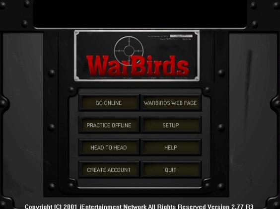
You have to really put yourself in the shoes of a brand new player, who has never experienced any game like Aces High. Who didn't ride in thru the UI of Warbirds, or Fighter Ace (which was way more tortured!) or Air Warrior. I mean, lord have mercy. Lets look at Warbirds 2001s UI right now!

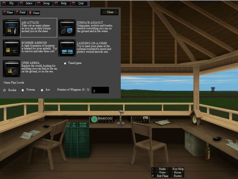
There's a design argument to be made that this is, 22 years old or not, more streamlined than the Kneeboard on the main page. It too could be streamlined more, but I think it starts to show 'what we've gotten used to' isn't always the best. Lets look deeper though!

Well, that's a pretty simple set of options. Many of which unsurprisingly are similar to our own. Can't imagine how that sort of happened.

Lets go deeper still!
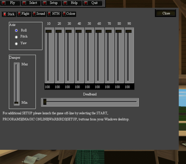
So, I'm cropping the next image to save some of my internet speed for folks running the slow stuff like myself, but I've selected 'Setup' now.

The Warbirds UI never goes deeper than a Primary -> Secondary functionality. Its UI is simple, but its clean and easy to flow thru. It's well named (which ours is as well) and clearly well thought out. I mean no insult when I say ours isn't well thought out, but it's clear from an outside perspective that its a bit of a mess. I imagine many of our old hands who were WB players could hop back into that older 2001 version of WB and have next to no culture shock for UI design.
More importantly, my silly ADHD self managed it at 11. Even now, showing it to the group I fly with they agree that its cleaner, the workflow is smoother. Sure, it is missing functionality that we have now, but they followed a very clear design setup for their UI. Nothing is ever more than 2 clicks away. That includes a help button that opens a (now defunct of course) Windows Online Help file!
Aces High quite single handedly beat the mess out of her sister games. There's no ifs and or buts of that. Warbirds and Fighter Ace had major issues as well, and Aces Highs gameplay was just so much better that it was beyond the pale, but the UI has been stretched on far too long in the tooth. Lessons were clearly learned from the WB team about gameplay, but I hate to say their UI design still has something to teach.
