There's no doubt modelling makes you strange... and I agree that the virtual lighting in AH presents challenges. What you see in PS is not what shows up in AH. I've had the same problem with the weathering, which looks great in PS, but does not show up in AH.
As having skinned many aircraft myself, I fully agree.
Like I said, the bright contrasted colors you are using are clearly intended for either; 1) real life painting, or 2) lighting conditions under which a modeller can photograph a plane and make it look right, or 3) building a mono-tone profile picture for use on the net.
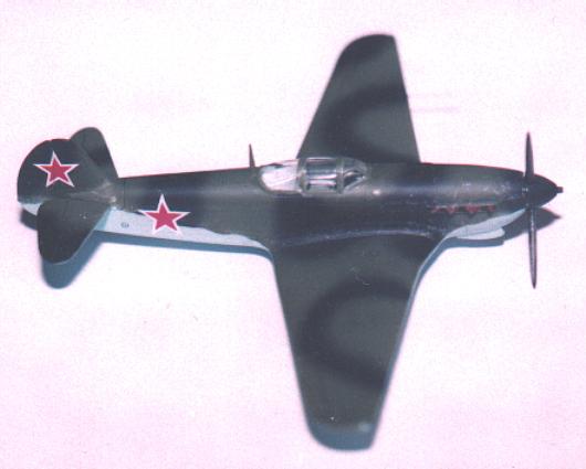
The above example is what lightings can do to colors. This is a pic of a Yak-9 model featured in Mr. Pilawski's site, which he built himself. It is using the standrad two-tone green camou of the VVS which was extensively used before '43.
Those colors, look nothing like Pilawski's own take on the standard VVS camou.
...
And of course, his suggested colors in that profile pic, looks also hugely ifferent, from the real two-tone green camou which we can observe from reconstructed photos. (both pics are of Mig-3 in the two-tone green, light blue standard VVS camou)


The point is, the color chips serve a specific function for certain instances, but more often than not, it quickly contradicts the "feel" when skinning aircraft.
Which, of course is the essence of 'scale effect' on color, it's just much more noticeable here. Over time, I've tried to stop arguing about 'accuracy', because the only reliable reference is an actual photograph and the guy who painted the airplane, and there are problems with both of those ( memory fades, photos don't print in true color, etc. ). I've obviously not entirely succeeded.
At any rate, the "accuracy" of provided examples are almost 100% hypothetical. Aside from the USAAF or the USN, there's virtually no known real life sample of actual RLM camou or VVS camou - which makes skinners free of contradiction. We skin planes to make it look right!
I'm really making an effort to overcome my 'institutional arrogance', in that the paint chip 'must be' right, which is one of the reasons I asked for help. One factor is there is a style ( for streaks, dirt and panel lines, and so forth ) that folks are used to looking at in AH which may bear no resemblance to reality, so some concessions must be made to style to 'make it look right' as well as to compensate for scale effect and the AH lighting. It's a difficult adjustment to make.
And I've still got to deal with the paint feathering and several other problems not related to the shade of paint.
So, what would have Souther Front VVS camou looked like?
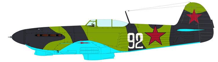
The two colors are respectively referred to as ochre-brown and sand-brown. The Southern Front stretched near the Black Sea area was very different from the lush green steppe lands - often with wide stretches of dirt and very sparse vegetation. While the sand-brown/ochre-brown scheme was itself very rare in the VVS, still, in effect these camou colors were aimed at achieving the same thing as RAF or Luftwaffe Desert Camo.


The profile drawings here, are of Mig-3s of the 7th IAP VVS stationed at the Black Sea area. The light brown tone used in the two aircraft are the basic examples of the "sand-brown" tone. The darker brown tone, was used in many other fronts as well.
And last, but not the least - the color pics of the Yak-9T that I first linked: those were from Mr. Pilawski's website too. The description of the photo goes;
"Paints and decals supplied by E. Pilawskii." In other words, Mr. Pilawski himself, thinks the color should look that way.

The end result is always more important than what a set of data might suggest, and that is my final take on this issue.
Thanks for listening!


