Author Topic: viva la difference (a calm cool collected skinners perspective on the new version)  (Read 1082 times)

Offline Citabria

  • Platinum Member
  • ******
  • Posts: 5149
first let me appologize for my previously immediately locked outburst of artists frustration.  I would like to convey my point of view as best I can however so...

heres me trying not to flip out and conveying my consternation at drastic terrain changes in the latest version that have left the majority of player made skins in the game looking way to light and washed out.

This is not a matter of monitor brightness or contrast.  It is a matter if interaction between existing plane artwork and the new terrain which is visible regardless of individual monitor discrepancies.  therefore can be controlled only at the source: the aircraft and terrain tile textures themselves.

looking on the bright side at least I made a few p40e's to the origional AH2 dark tile brightness and contrast and they look ok. however if this terrain persists as the new standard I will have to redo every skin I have submitted because the contrast and sifference between the skins and the terrain is to much for me to tolerate if this is indeed the prefered threshold for the arena's contrast color saturation and brightness.

waffle said it himself its all relative. the skins need to be calibrated to a standard background which thus far has been the old arena tile textures themselves.
this new terrain is well detailed and well made but it is of a different style that is nostalgic of warbirds 2.0. the chaos of realism is removed and there is now order and conformity in the textures. (I love the 3d modeling my only beef is with the textures and brightness and color saturation and contrast)

I just don't know what to strive for now. I have been going so hard striving for realism  with a bit of saving private ryan band of brothers coloring flare to the skins I have made recently but now I am just lost

I don't even know what looks good any more. now everything looks too washed out or to saturated.

the green is so green that it overpoweres everything and the dark is so dark well i dunno

please help I need sleep.


the terrain could be altered to match the brightness color and contrast threshold of the previous versions textures. if this could be done I would be thrilled with the new terrain

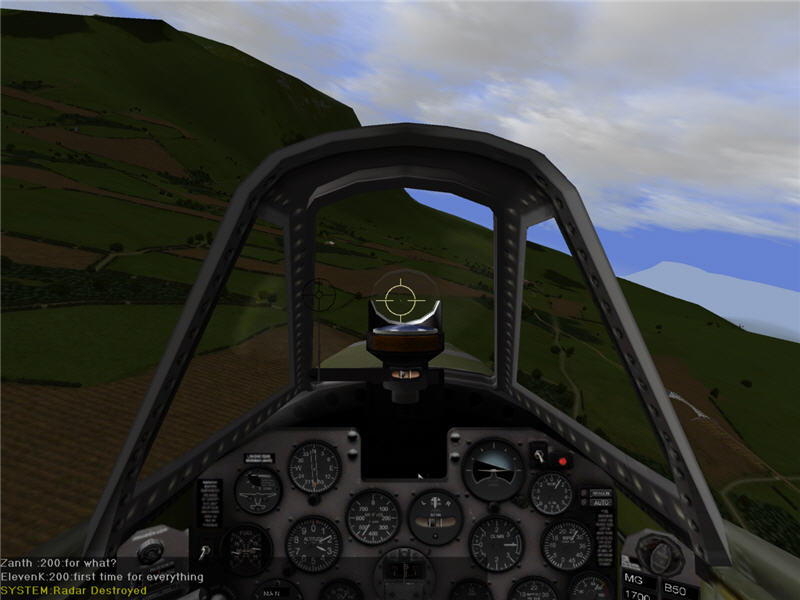
new version... the once shadowy and dark cockpits look pretty bright thought they are unchanged.


old version... with the bright terrain of AH2 that had been revised several times form the origional darknes that plagued it.


old version... the sun is shining bright on the wing of this p51 and on the ground below


new version...  the ground is dark the wing of this p51 still glows creating an unrealistic discrepancy


new version.... its just sitting there cut and pasted the plane is not part of the environment it dosnt fit


old version... its there flying in the air you can see its part of the scene the sun is shining on the plane and on the land and sky behind it. all together it pull sitself off as one complete picture
« Last Edit: April 14, 2007, 08:09:01 AM by Citabria »
Fester was my in game name until September 2013

Offline Helm

  • Nickel Member
  • ***
  • Posts: 600
viva la difference
« Reply #1 on: April 14, 2007, 07:06:45 AM »
It's looks superb Fester...Keep up the good work!
XO of ^"^Nazgul^"^
Proudly serving since campaign #13
"No Rain?" ...."No Rainbow, baby!" ....Bootsey Collins 2009

Offline Major Biggles

  • Gold Member
  • *****
  • Posts: 2987
      • 71 Squadron Website
viva la difference
« Reply #2 on: April 14, 2007, 07:18:31 AM »
really gorgeous skin fester, great work

71 'Eagle' Squadron RAF

Member DFC

Offline Citabria

  • Platinum Member
  • ******
  • Posts: 5149
viva la difference
« Reply #3 on: April 14, 2007, 07:23:05 AM »
argh your missing the point it dosnt fit in the new terrain.

it only looks decent in pics showing the old terrain textures.

 it was meticulously calibrated to fit in with those old terrain textures with as much contrast and color and brightness and sense of the sun reflecting on it as possible.

in this new setting it looks way to bright and washed out and devoid of contrast and color.
Fester was my in game name until September 2013

Offline SkyRock

  • Platinum Member
  • ******
  • Posts: 7758
viva la difference
« Reply #4 on: April 14, 2007, 07:38:48 AM »
I agree with you fes, the greens in the new terrain are unbearably green!  Also, I can't tell where the dmn ground is because it all just blends in to this Nickelodeon goo of green!

Triton28 - "...his stats suggest he has a healthy combination of suck and sissy!"

Offline Furball

  • Plutonium Member
  • *******
  • Posts: 15781
viva la difference
« Reply #5 on: April 14, 2007, 07:44:26 AM »
I never saw the big deal about the arena changes, in terrain, i thought it was pretty cool - but seeing the effect on skins i can understand the frustration of skinners caused by the new dark age.

Quote
Originally posted by Helm
It's looks superb Fester...Keep up the good work!


Quote
Originally posted by Major Biggles
really gorgeous skin fester, great work


Poor Fester... Nice comments, but i'm sure that just added to the frustration

:rofl
I am not ashamed to confess that I am ignorant of what I do not know.
-Cicero

-- The Blue Knights --

Offline Kweassa

  • Platinum Member
  • ******
  • Posts: 6425
viva la difference
« Reply #6 on: April 14, 2007, 08:03:46 AM »
Some mock-ups for the colors I see fit for my monitor. It might be a tad bit too light for some people, but I definately think that's still better than the "Darkside"...


 Another slight touch, as one might notice, is that I tried putting in a bit of different tones of green on the terrains.

 I've noticed that some people were complaining the terrains are still too dull, even after they adjusted the gamma and brightness of their monitors... I think I know what they mean.

 Even with much lighter tone textures, the terrain looks very uniform, almost seems like artificial grass football field, or perhaps golfing fairway. That's why used a bit of brush touch to give very slight, but noticeable differences in the tones of grass areas. I think it looks overall much better this way.

Offline Fencer51

  • Aces High CM Staff (Retired)
  • Platinum Member
  • ******
  • Posts: 4677
viva la difference
« Reply #7 on: April 14, 2007, 08:15:17 AM »
Yeah that what was bothering me Fester, you hit it on the head, I could not figure out what seemed off when I was in a plane.

The terrain is interesting and new.  It's the atmosphere that is off.  It was a clear day here yesterday.  The sky was light blue from about 8am until dusk.  It was a clear day yesterday in the TT map at "noon" the sky was darker than it was here at twilight last night.

It just doesnt seem realistic.  Now if there is some grand plan that is all godo, however it is difficult to see well when flying.  Using anything but the hi res texture pack is painful.
Fencer
The names of the irrelevant have been changed to protect their irrelevance.
The names of the innocent and the guilty have not been changed.
As for the innocent, everyone needs to know they are innocent –
As for the guilty… they can suck it.

Offline Citabria

  • Platinum Member
  • ******
  • Posts: 5149
viva la difference
« Reply #8 on: April 14, 2007, 08:23:30 AM »
all I want is the old texture threshold for color and brightness and contrast back.

it could remain the two toned green for a long time as long as its a two toned green that is of the same brightness and color saturation as the previous terrain tile textures which had been tweaked so well.

does anyone remember ah2 beta? do we really have to go through all this suffering again when the reference settings for acceptable color saturation and brightness and contrast have already been established by the textures from the previous version?

changing whats in the textures and changing the 3d models is welcomed always but  the already established standards for COLOR SATURATION, BRIGHTNESS and CONTRAST have already been established and must be followed for the sanity players making skins and to establish consistency in the interaction between the skins and the terrain itself.
Fester was my in game name until September 2013

Offline Hajo

  • Platinum Member
  • ******
  • Posts: 6034
viva la difference
« Reply #9 on: April 14, 2007, 08:34:41 AM »
Citabria I agree completely.  My eyes now seem to have trouble adjusting to the aircraft and terrain when in a furball.  They seem like two entities of different contrast.  I don't know how to explain it but maybe at 57 years of age the difference between the smaller aircraft partially framed by the dark green terrain and bland water below is hard for the eyes to adjust to.  When I first saw the terrain from about 10K the first thing that came to mind was "This looks like Air Warrior II?"  I went to the BBS and did calibrate my SONY 22" CRT which is a top of the line monitor.  I also raised the gamma but that seemed to not help.  Between the fog on NDIsles and the increased gamma viewing ths skins in contrast with the water and green terrain is not comfortable and I find myself straining to see clearly.

What depth perception in this environment has disappeard.  Maybe I'm not explaining exactly what appears to be wrong imho.  The technical end of setting textures I know nothing about.  But what I do know is that it is a more difficult environment for the aircraft to battle in.

You're skins are incredible.  I do hope HTC is listening here.  I really am having a hard time adjusting.  The contrasts or lack thereof aren't helping.

Hajo
« Last Edit: April 14, 2007, 08:38:01 AM by Hajo »
- The Flying Circus -

Offline Eagler

  • Plutonium Member
  • *******
  • Posts: 18118
viva la difference
« Reply #10 on: April 14, 2007, 08:52:21 AM »
well stated argument Fester

gotta say I like the new look of the latest update but when shown the difference with the skins as you do, the old combo skins/textures do look more realistic for sure
"Masters of the Air" Scenario - JG27


Intel Core i7-13700KF | GIGABYTE Z790 AORUS Elite AX | 64GB G.Skill DDR5 | 16GB GIGABYTE RTX 4070 Ti Super | 850 watt ps | pimax Crystal Light | Warthog stick | TM1600 throttle | VKB Mk.V Rudder

Offline thndregg

  • Platinum Member
  • ******
  • Posts: 4032
viva la difference
« Reply #11 on: April 14, 2007, 09:06:15 AM »
Good points all. I concur. Seems a bit extreme on terrain color.
Former C.O. 91st Bombardment Group (Heavy)
"The Ragged Irregulars"

Offline Widewing

  • Plutonium Member
  • *******
  • Posts: 8800
viva la difference
« Reply #12 on: April 14, 2007, 09:08:46 AM »
Quote
Originally posted by Fencer51
Yeah that what was bothering me Fester, you hit it on the head, I could not figure out what seemed off when I was in a plane.

The terrain is interesting and new.  It's the atmosphere that is off.  It was a clear day here yesterday.  The sky was light blue from about 8am until dusk.  It was a clear day yesterday in the TT map at "noon" the sky was darker than it was here at twilight last night.

It just doesnt seem realistic.  Now if there is some grand plan that is all godo, however it is difficult to see well when flying.  Using anything but the hi res texture pack is painful.


I noticed some odd shadowing last night. The sun was low in the west, and while banking a Boston, I switched to the external view. The upper surfaces facing the sun were darker than the lower surfaces, which were much brighter, even though they should have been quite dark.

I spent a good 30 minutes playing with monitor settings (Viewsonic LCD) and gamma to get what I consider acceptable lighting. I don't care for the absolute lack of texture to the ground (not including trees, but the grass or meadow). This creates the appearance of a pool table top, rather than the earth.

As Fester says, the skins have an unusual, washed-out glow, regardless of whether I run at 512 or 1024.

There's much work to be done to get to where we were before the update, which, I suspect, is why the "comprehensive" patch is taking a while.

Also, seas and ponds are too grey, they need a touch more dark blue

My regards,

Widewing
My regards,

Widewing

YGBSM. Retired Member of Aces High Trainer Corps, Past President of the DFC, retired from flying as Tredlite.

Offline Speed55

  • Silver Member
  • ****
  • Posts: 1263
viva la difference
« Reply #13 on: April 14, 2007, 09:33:39 AM »
Quote
Originally posted by Widewing
I don't care for the absolute lack of texture to the ground (not including trees, but the grass or meadow). This creates the appearance of a pool table top, rather than the earth.


Exactly the way i feel.  Overall i think the new terrain patch is great and the new trees,  hedgerows,  beaches, and new  detials at airfields and v-bases are all excellent.

You can see a major difference on the last two pictures posted by fester, and by looking at them, you would think that the old and new terrains are opposite.

I'd like to see different shades of green on some of the tiles to add some depth near hills and mountains, and also the farm tiles again which looked fantastic.
"The lord loves a hangin', that's why he gave us necks." - Ren & Stimpy

Ingame- Ozone

Offline The Fugitive

  • Plutonium Member
  • *******
  • Posts: 17859
      • Fugi's Aces Help
viva la difference
« Reply #14 on: April 14, 2007, 09:43:54 AM »
Quote
Originally posted by Kweassa
Some mock-ups for the colors I see fit for my monitor. It might be a tad bit too light for some people, but I definately think that's still better than the "Darkside"...
 
 Another slight touch, as one might notice, is that I tried putting in a bit of different tones of green on the terrains.

 I've noticed that some people were complaining the terrains are still too dull, even after they adjusted the gamma and brightness of their monitors... I think I know what they mean.

 Even with much lighter tone textures, the terrain looks very uniform, almost seems like artificial grass football field, or perhaps golfing fairway. That's why used a bit of brush touch to give very slight, but noticeable differences in the tones of grass areas. I think it looks overall much better this way.


unfortunately, to get that "brushed touch" your talking about I think it would require a crap load of new tiles as well as a super computer to be able to pop them up fast enough not to cause stuttering.

I agree that the existing tiles should be lighten and the contrast adjusted to get them more in line with the way it was. Hate to see all Fester work drive him nuts :D